We recently returned to our discussion about antiracist research methods, and want to open a new dialogue about how we at DataWorks can engage with data in an antiracist way. In this blog series, we ask ourselves: “in what ways do we think about data that we may not even realize are racist?”
In this post, we’re starting to think critically about how we represent trends in time.
A point in time
Timelines give us the opportunity to look at specific points or events and compare them to similar events at other times. However, these seemingly discrete points in time can lead to flawed interpretations.
An example is a timeline often associated with African American history, shown in the tweet below:
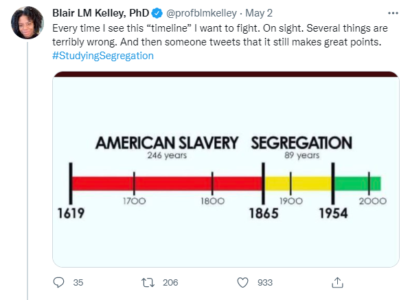
Based on this representation, we are to assume that 1865 marked the ending of American slavery and the beginning of segregation (which we are to view as an improved environment signified by the yellow color), and that segregation ended in 1954 as we entered a green zone. However, our experiences prove otherwise. As Dr. Kelley puts it, “What’s so green about it?”
Historic events don’t begin and end, they flow
Rethinking our timelines can better demonstrate the legacy of historic events. One example is to have more interconnectedness, like the image shown below:

It shows that events flow together in a non-linear way and continue to have impacts on people even after they end.
Another is the Diné wedding basket, which has several interpretations. One of which is a spiral map through which people chart their life course. The spiral lets us visualize pain and joy interacting and shaping who we become and how we relate to our families and communities.

We’re asking ourselves: What assumptions are we making when we display data in timelines? What do we miss by making these assumptions?
Trends in Durham neighborhood characteristics
We can draw our attention to similar interpretative challenges in the Durham Neighborhood Compass. On the Compass, we display data (e.g. maps of neighborhood characteristics, like median household income) as well as “metadata” (narrative information about the data and why it is important).
One piece of data we include is a chart showing annual trends in median household income. For example, the median household income for Durham County in 2011 was $50,078 and increased to $58,190 in 2018. While this provides important historical context, it also assumes that the years are discrete. Each dot represents the year that the census published data. Because the points are visually distinct, one can look at the chart without appreciating that the median income in 1980 is still impacting the community today.
The metadata on median household income starts with the sentence: “The median household income provides an indication of how well people are doing financially in a neighborhood.” When thinking about this from an antiracist perspective, we question the validity of this sentiment. Whose financial wellbeing does median household income reflect?
In our last post, we wrote about how summarizing income over a large area hides disparities, but this metadata also largely ignores history. It tells us the median income from the most recent census data.
What can we do better?
At DataWorks, we strive to prioritize those whose voices have been historically marginalized, starting by preserving and centering their stories. We know from our community partners, and we show in the Compass data, that oftentimes new residents are arriving with higher incomes than the longstanding residents. We discussed disaggregation approaches in our previous post, including documenting income trends among long standing residents alone. This will help our data summaries better reflect marginalized people’s experiences — where they continue to advocate for basic resources like sidewalks, covered bus stops, and roads that are properly maintained.
While the data year slider in the Compass may not lend itself to a non-linear visualization, we can begin to rethink the narrative pieces (metadata). As we critically evaluate and rewrite them, we’re asking ourselves: Why is history relevant to this metric? Whose history has been documented and whose has been ignored? We invite feedback and thoughts as we enter this process.
This is part 3 of a multi-part blog series that documents our critical thinking about antiracist data methods.
Antiracist Data Method Series: